"Amazing! I can't stop thinking about your portal. Please tell me we can actually build this out. Pretty please!"
--Lindsay McIntosh, Project Stakeholder
Designing a dashboard from scratch
Project Type
Nonprofit management dashboard (student project)
My Roles
UX Research, Strategy & Design; Branding; UI Design; Prototyping
Constraints
Limited product scope and time frame (~80 hours)
Deliverables
High fidelity prototype
-
I had about 80 hours to research, design, prototype, and test a nonprofit management dashboard for MVP (minimal viable product) launch.
-
I worked with a client to design a solution specific to her needs.
-
I met with my mentor and academic facilitator and peers 2 x/week for critical feedback.
Final Result
Musica Sierra is a small performing arts education non-profit doing big things! The stretched-thin executive director asked for a dashboard that would:
-
have a simple interface that's easy to use
-
be aesthetically pleasing
-
help her manage the organization's many grant proposals
-
capture relevant KPIs through simple data visualizations
-
allow her to efficiently track and manage deadlines and stakeholder communication
In this case study, I'll show you how I designed a product that met my client's needs, while potentially serving a larger market.
How can I design a useful, usable, desirable product that solves genuine human needs?
Design thinking gave me a structure for:
-
understanding the human need driving this product
-
creative ideation
-
determining the feasibility and viability of features
-
lightweight iteration
Design Thinking Process
Usability Testing
Iteration/Revision
Wireframes
UI/Branding
Interactive Prototype
Project Brief
Competitive Analysis
User Research
Research Synthesis: Empathy Mapping Affinity Mapping Persona
Empathize
Define
Ideate
Prototype
Test
Sketches
Feature Map
Task Flows
What can I learn from products that are already out there?
A high-level competitive analysis on 5 nonprofit management dashboards helped:
-
establish consistency with current market products
-
highlight potential opportunities


💡 Comp Analysis Takeaways
-
Most products are focused on donors and fundraising events. (Potential opportunity for grant proposal features.)
-
All products are Cloud/SaaS-based.
-
Some have desktop apps, most have mobile apps w/limited functionality.
-
Potential opportunity for 24/7 support.
💎 What Users Value
-
ease of use/simple UI
-
custom reports
-
calendar integration
-
reliable support/training
-
$ value; free trial; straightforward pricing structure
Market product test drive
A look into a competitor product provided insights and ideas on content, architecture, UX writing, and UI/visual design. I was able to use aspects as a guide and make improvements to the design.


How can I design a product that serves my client and the larger market?
-
I held an in-person ethnographic interview with my client to observe and ask questions about her current process, motivations, and pain points
-
I interviewed 2 other nonprofit management professionals for broader market insight.
Interview & observe client in her environment
to form a comprehensive profile for immediate problem-solving
Interview other similar users
for future potential market opportunity
Synthesize the data for insights into problem-solving
through empathy and affinity mapping
Empathy Mapping
To establish empathy and begin to build a portrait of the humans who would be using this product, I synthesized the data first by creating an empathy map for each participant.

Affnity Mapping
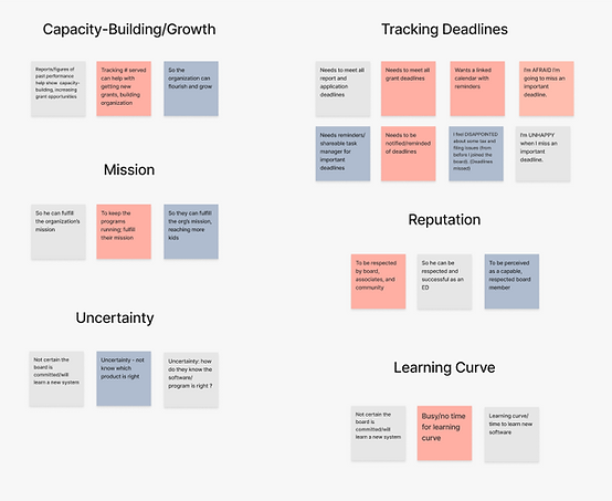
To organize the data and discover shared pain points, motivations, and behaviors, I created an affinity map. Then, to further identify insights, I clustered the same data into six notable categories.

Insights
Users are mission-driven
Tracking & managing deadlines is crucial
They're worried about the learning curve
They want to be seen as credible/capable
Sticky notes and outdated organizational methods cause them to miss deadlines
They have shoestring budgets and need to demonstrate value to justify cost
How can I maintain empathy throughout the design process?
I used the interview insights to create a single persona representative of all three users but focused largely on the client. I kept this artifact handy to help remind me of the human I was designing for and to guide me in curating design decisions that address the client's needs.
PERSONA: DANA MCCOY

Key Takeaways
Wants to improve organization & efficiency
Deadline tracking is crucial
Needs something that's easy to use with robust help/support
Needs to have all grant proposal details in one place
Most work is focused on grant proposals
Plans to have admin help in the near future
How do I decide which features to include?
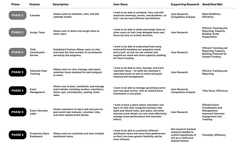
For an outcome-focused design process, I made a list of potential features and vetted each one by:
-
ensuring it answered a user need
-
documenting research supporting viability
-
considering feasibility within constraints
-
looking for innovative, impactful opportunities
FEATURE PRIORITIZATION: MVP

FEATURE PRIORITIZATION: FUTURE PHASES

Key Features
Task Management
Improve productivity, reduce frustration, and increase funding opportunities (no more missed deadlines!)
Key Performance Indicators (KPIs)
Demonstrate capability with stakeholders and improve positioning through a current snapshot of funding goals and progress
Grant Proposals
Reduce friction by making it easy to view and manage all grant proposal assets in one place
Help & Support
Reduce frustration and increase productivity through robust support and training
Communication
Efficient time management and improved relations through quick, easy communication with grant funders and stakeholders
How should the pages be organized for a satisfying user experience?
Site Map
I created a visual sitemap demonstrating a simple, logical hierarchy to support way-finding.
-
For quick reference and accessibility to other screens, the main dashboard is the default home screen.
-
I added just enough detail so that I could work quickly and move to task flows & wireframes.

How will the user interact with the features and find what they're looking for?
Task Flows
I created 4 high-level task flows (for usability testing) based on primary features:
-
Send an email
-
View proposal/add a comment
-
Update task status
-
Find a help video
Task flow logic helped expose any issues with interaction design and served as a useful framework for wireframes.

A lightweight approach to data-heavy design.
-
I started sketching ideas early in the design process and continued through wireframing.
-
Sketches helped me plan the layout and data visualizations in a quick, lightweight fashion before building shareable (and more resource-intensive) wireframes.
Designing the 2-second data visualization
For clear, effective data visualizations (enhancing user confidence), I sketched various versions of each data visualization 'til I was satisfied with the clarity of the design.


Designing a dashboard for efficiency of use and scannability

-
For an efficient and personalized user experience, the client can use the top navigation to perform a variety of quick tasks from any screen.
-
For scannability and visual prominence, I placed the main menu on the left.
-
The client can quickly scan the dashboard KPIs, task alerts, and calendar, allowing her to be efficient with her time and maximize productivity.
Designing for speed and flexibility

-
The advanced search function gives the client the flexibility to search by a variety of search criteria, including predictive search.
-
The client wanted a quick, no-hassle way to send emails, so I designed email templates for different use cases that allow for personalization.
Easy access to proposals and deadlines

The client asked to have grant proposal details easily accessible and in one place, so I explored different layouts for:
-
frictionless viewing and editing
-
easily updating grant proposal deadlines and statuses
Global access to help & support

For easy access to help and documentation (increasing user confidence and reducing friction), I included a help dropdown menu with various sub-menu items on the top navigation bar, accessible from any screen.
How can I efficiently prioritize and organize page content?
Mid-Fidelity Wireframes
-
Allowed me to view and organize content on each page appropriate to digital display sizes.
-
Gave me a buttoned-up version of the low-fi hand sketches for feedback & review.
-
Working with a gray scale palette allowed me to work more efficiently on the architecture and some detail without spending valuable time on branding.
Desktop Wireframes
LOG IN

MAIN DASHBOARD

PROPOSALS DASHBOARD

SINGLE PROPOSAL QUICK-VIEW

VIDEO LIBRARY

SELECTED VIDEO

Mobile App Wireframes
📌 Research indicated that the mobile experience would be most effective through an app interface, focused on quick, easy-to-perform functions when users are on-the-go.
For example:
-
Adding a new potential donor they've just met while they're at an event
-
Sending a quick "thank you" email while they're out in the field
-
Viewing the dashboard to get updated stats before a board meeting
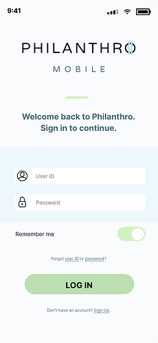
LOG IN SCREEN

Dashboard sections are collapsible on mobile for reduced scroll.
MORE MENU

DASHBOARD

The story and branding of "Philanthro"
I needed to create and brand the SaaS company that would host the management platform, including:
-
the name
-
brand traits
-
logo design
-
color palette
-
typography
The Name
The name Philanthro comes from the word "philanthropy," which is derived from the Greek "phil" ("love of") and ("anthro" or "anthropo" ("humanity"). This would be a fitting name for a company that builds management dashboards for nonprofits.
Brand Traits
Trustworthy
Wealth
Capable
Modern
Simple
Color Palette
-
Utilized brand traits for anchoring stylistic choices
-
Primary blue and white color palette = simplicity, capability, and trustworthiness
-
Greens and golds = wealth/prosperity mindset
-
Light and dark modes considered
-
Accents, tints, and shades account for a variety of use cases and asset types such as data visualizations

Typography
-
For a cohesive look and high level of legibility, I used "Inter" for both headings and paragraph text.
-
Inter is designed specifically for computer screens and features a tall x-height to aid in readability.
Inter Bold
Inter Medium
Inter Light
LOGO - DARK BG
LOGO - LIGHT BG
Bringing the designs to life through color
-
Once the mid-fidelity wireframes were approved and the client was happy with the features and architecture, I added color and other branding elements to produce light and dark mode high-fidelity (full color) screens.
-
To aid in visual organization and reduce cognitive load, I employed Gestalt principles to create a spacious-feeling UI. 😌
Select Desktop Screens
(Version 1, prior to iterations)
LOG IN SCREEN


HOME DASHBOARD


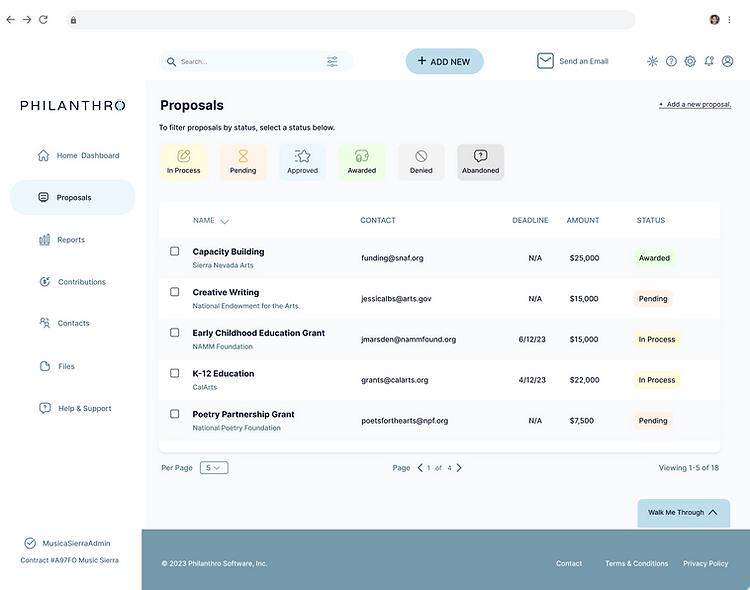
PROPOSALS


VIDEOS


Select Mobile Screens
LOG IN SCREEN
HOME DASHBOARD


How could I gauge the success of the design?
-
I created a high-fidelity interactive prototype using the five task flows.
-
I held 3 moderated, in-person usability tests.
-
Success metrics:
-
ease of use
-
errors
-
overall user experience (What could be improved?)
-
Testing Results Summary
Biggest Wins
Friction Points
✅ UI/general look and feel
✅ Organization/information hierarchy
✅ Proposal statuses section
✅ Email widget/template option
⚠️ Couldn't find on-demand videos
⚠️ Accessing proposal details too complicated
⚠️ Need validation/feedback after note is added
How do I know which iterations to prioritize?
The usability testing sessions produced a generous amount of feedback regarding:
-
usability improvements and
-
insights into the utility and viability of current and potential new features.
1) To help me organize the results, I separated the testing results data into two categories: suggestions and friction points.
SUGGESTIONS

FRICTION POINTS

2) I used an impact vs. effort matrix to help me prioritize revisions.
-
Focused on "quick wins" (highest potential impact with the least amount of effort)
-
Considered iterations in "big bets" and "schedule" quadrants, time-permitting
IMPACT VS. EFFORT

Summary of Prioritized Iteratons
Work on deadlines/tasks due section for naming convention and efficiency of use
Make it easier/more obvious to find help videos
Make usability and efficiency improvements to proposals dashboard
Need to consider where users will go to view all emails (communication center/page?)
Documenting an improved user experience
I completed eighteen iterations in total, using a “before/after” format with annotations documenting reasons for each iteration and how it improves the user experience. Below are some examples.
PROPOSALS DASHBOARD: BEFORE

PROPOSALS DASHBOARD: AFTER

1
-
User feedback: replace email/contact field with grant ID# - more appropriate to user needs.
-
Typographical consistency: Column heading text has been changed from all caps to title case.
-
Reduce confusion: "Name" changed to "proposal name"
-
Sorted column text changed to bold weight (other columns light weight) to indicate column sort status
2
User feedback: sort by all columns for greater flexibility and ease of use. (Note: Sorting by columns such as Grant ID# may not be as valuable. We will discuss this with the client.)
VIEW/EDIT PROPOSAL: BEFORE
In order to view or edit a record, it first required selecting the record (1). This triggered the "delete" and "view/edit" prompts (2) . Then the user had to select view/edit (3) to open the proposal quick-view card.


VIEW/EDIT PROPOSAL: AFTER

3
-
Flexibility/efficiency of design: Clicking on the proposal name immediately opens the proposal quick-view card. This will reduce user friction which was observed to some degree with all 3 participants.
-
Reduce friction, minimalist design: Removed “delete” option, as users agreed that “delete” was not needed at this stage (if at all). (Proposals would more likely be archived than deleted. Note: "archive" option should be added to proposal expanded view.)
ADD A COMMENT TO PROFILE: BEFORE
-
Lack of visibility of active status: INACTIVE > ACTIVE: Upon clicking in the comment field, user profile pic and comment icon appeared lower right to indicate active status. (This was not noticeable to testing participants.)
-
Lack of visibility of success status: After saving, user was redirected to main “proposal dashboard” page, with no confirmation that the comment was accepted, so users questioned whether the comment was saved.
Inactive State

Active State

ADD A COMMENT TO PROFILE: AFTER (1 - 4)
1 - Inactive State

4
-
Consistency: "Email" changed to "Send Email"
-
Conventional naming: changed copy from “Type a note” to “Comment”
-
Reduce cognitive load: Comment icon (inactive state) has been added
3 - Confirm

6
Visibility of system status: User receives success validation through:
-
UX Copy "You commented"
-
Profile pic clearly visible
-
Time (now)
-
A new inactive state dialogue box
2 - Active State

5
Visibility of system status: User input triggers comment icon (active state) to move below the input field
4 - Other User View

7
Other users can view the comment details, including date and time.
Summarizing a beastly (but beautiful) project
This was a massive learning experience. I took a big dive into research and spent hours problem-solving the perfect nonprofit management dashboard design for my client that could also serve other users. And I truly enjoyed it!
What's Next
There is a lot of work to be done, even on these few screens, to troubleshoot logic and interaction design. If this were a real-world project, I would:
-
take the full set of iterations to the team for feedback, and
-
plan for more usability testing to gauge the level of success.


