Overview
Project Type
Single feature design for existing product
My Roles
UX Research & Design; Prototyping; UI Design
My Team
Design boot camp peers and mentor
The Final Result

Users love their Garmin watches and app analytics - but they were crying out for a better race-day training feature.
In this case study, I'll show you step-by-step how I met this need by designing a way for athletes and fitness enthusiasts to easily track and improve their fitness levels through a data visualization chart, with custom activity tracking and toggle-able data sets for greater personalization.
But Wait - There's More! :)
To further enhance user engagement and excitement, I designed a way to link an upcoming race event so users can connect performance metrics for targeted fitness training, social sharing, and a little more fun.

The Brief
This capstone project was an opportunity for me to flex my muscles in designing a single feature while working within the constraints of an established brand. Students were prompted to:
📱 Select a current-market product for feature-add
🕵🏻♀️ Research a legitimate problem to solve
👷🏻♀️ Design a useful, usable, desirable feature while working within established constraints, including:
-
existing visual design/branding
-
limited time frame
-
small research sample size
Design Thinking Process
Although this was only a single feature design, I still needed to research and define problems to solve in an innovative, actionable way. So I used the Design Thinking process as a framework.
Empathize
-
Project Brief
-
Competitive Analysis
-
User Research
-
Subject Matter Research
Prototype
-
Wireframes
-
High Fidelity Designs
-
Interactive Prototype
Define
-
Affinity Mapping
-
Personas
-
Problem Statement
Ideate
-
Feature Identification & Ideation
-
Task Flows
Test/Iterate
-
Usability Testing
-
Stakeholder Presentation
-
Iteration/Revision
Primary Research
I started with a dual challenge:
-
To find a problem to solve, and
-
To learn more about the sports and fitness app technology space so I could be more knowledgeable and empathetic throughout the design process.
I set out to kill two birds with one stone.
Note: 🐦 No birds were harmed in the designing of this feature.
Competitive Analysis
I performed a broad competitive analysis of other fitness watch/tracker companies, plus I scanned 3rd-party tech, fitness, and outdoor review sites, app user forums, and app store ratings and reviews.

The comp analysis provided a decent overview of the company, product and feature/market focus, but a lot of the data were related to the watch/wearable, and not as much on the app that the watch syncs with.
While this part of the research was not as helpful from a feature design perspective as I had hoped, it did affirm that Garmin is a leader in the outdoor and fitness app technology market and it gave me a launching point for interview questions.


Key Takeaways
Industry Leader
In many ways, Garmin is the industry standard for sports & fitness smartwatches for running and other endurance activities.
Strong Analytics
People love Garmin’s data and analytics. Users are happy with detailed metrics and the many activity tracking options -- from endurance activities to sleep and hormonal cycles.
Room for Improvement
-
Clunky, complex, outdated interface
-
Issues with strength training tracking & metrics
-
The need to use other apps for performance metrics/race training
-
Lack of sharing/community features
User Research: Interviews
Building on the data I discovered through my desk research, I wanted to talk directly with Garmin Connect users to learn more about their behaviors, motivations, values, and experiences with the app. I needed to gather as much data as I could to effectively problem-solve.
Question to be answered:
How can I make a positive impact on the Garmin Connect user experience by adding a feature which:
...aligns with (assumed) business goals of increased sales and greater market share?
aligns with users' values, motivations, goals, and pain points?
can be achieved within project constraints (such as time, small sample size, lack of subject matter expertise)?
Introducing... the Garmin Users
(My truly awesome interview participants)
These are stock images used as a representation of the interview participants -- but the likenesses are pretty darned close!

RR
Female, 51
Healthcare Management
Former competitive athlete

SA
Male, 38
Product Designer/Architect
Competitive athlete
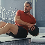
Male, 56
Financial Services
Former pro skier/cyclist
TP

KC
Female, 41
Educational Consultant/Entrepreneur
Competitive athlete
I held one-on-one video interviews with all four participants, then compiled my notes and performed an affinity mapping exercise using Figjam, looking for any patterns or kernels of inspiration that would lead to a shared problem to solve.

Overall, users love their Garmin watch and app analytics.
They had many shared characteristics, and surprisingly few pain points.
4/4 Users
RR
TP
SA
KC
Wear their watch and track activities daily or nearly daily
Are motivated by improved fitness or better performance
Value the detailed metrics and tracking trends over time
⚡Friction Points
All had issues with the "strength training" tracking and metrics
⚡ RR and KC use other apps to track strength training sessions.
⚡TP and SA don't use the strength training settings at all.

"The strength training setting doesn't provide accurate feedback so I don't bother using it."
💭 Decision Point
I was in a quandary. Focusing on the "strength training" issues seemed like a no-brainer for problem-solving. However...
Although it was the most common pain point, users ALSO said they either didn’t care too much, or they had a reasonable workaround. (As a Garmin user, I am also frustrated by the strength training settings, so I was fully prepared -- and admittedly delighted -- to design a feature to address these issues.)
However... when taking an honest look at the interview data (my primary research vehicle), I realized that focusing on improvements in this area might not be as beneficial to my users as I had hoped.
Could I find something more impactful (and fitting) to focus on?
With fingers crossed, I went back to the research.
SA
KC
⚡#2 Shared Pain Point
⚡2/4 users were disappointed with the lack of analytics to support performance training.

"Even with all of Garmin's data, it's difficult to know how to time my next fitness 'peak' for the next race."

"The lack of a performance graph is frustrating." (Uses TrainingPeaks and/or Strava for race training)
The Opportunity
Even though only 2/4 users expressed frustration that they didn't have a way (through Garmin alone) to properly analyze their fitness performance statistics, solving this problem checked a lot of the boxes for the business and for all users because it's exactly the type of analytics Garmin users love. 💙
Aligns with Business Goals
Satisfied, engaged users will likely result in increased sales and greater market share
Aligns with User Goals
Aligns with users' values, motivations, goals, and pain points.
Within Constraints
It should involve no more time & effort than focusing on improving strength training activity tracking deficiencies.
Let's see how focusing on fitness performance analytics aligns with users' pain points, motivations and values -- and how it could help solve their problems.
Tracking my fitness performance keeps me pumped!

✔️
✔️
Motivation: improve sports & fitness performance
Values: excellent tracking and metrics (lots of data!)
These fitness performance analytics make feel like a pro athlete again!

✔️
✔️
Motivation: improved performance
Values: being able to track health and fitness trends over time
Now I don't have to use separate apps to train for an event!

✔️
✔️
Pain Point: uses addit. apps to track performance trends
Values: being able to communicate performance levels with coach
Can't wait to use these performance analytics to smash my next race!

✔️
✔️
Pain Point: planning her next training peak is a mystery
Motivation: Better performance/ improve PB
User Personas
After synthesizing all the interview data, I needed to distill it down into a more bite-size format -- something I could use as a single artifact at the center of all design decisions.
I created two personas - Katia and Tim - based on various behaviors and characteristics gleaned from my four user interviews.
Each of the portraits below forms a comprehensive picture of a type of human who will be using the product.

Age 39
Katia
Performance-Driven Athlete
"I need to track every single ounce of sweat."
Behaviors
-
Works M-F as a professional designer
-
Trains 5-6 days/week
-
Takes care of two young children
-
Wears her Garmin watch 24/7
-
Uses several apps and devices for tracking
Pain Points
-
Gets frustrated with the Garmin app menus
-
Can't share custom workouts with training partners or coaches
-
Can't track performance levels over time
-
Has to use too many different apps to to meet her sports performance needs
Jobs to be Done (Goals)
Accurately monitor fitness levels and fatigue over time
Prepare for race day
Tech IQ

Age 52
Tim
Demanding Fitness Enthusiast
Although my pro athlete days are behind me, optimizing my fitness levels is still a top priority.
Behaviors
-
Monitors and optimizes everything 24/7 - from his investments to his health
-
Hires personal trainers and assistants
-
Works hard and plays hard
-
Tracks trends over time
Pain Points
-
App's “smart tracking” doesn't work
-
Manual activities too much work to add (strength training not accurate)
-
Can’t track detailed fitness levels over time
Jobs to be Done (Goals)
Have an accurate account of stress and fitness levels
Spend more time being active, less time deciphering data
Look and feel like the pro athlete he used to be
Tech IQ
Defining the Problem
Problem Statement
Before launching into feature ideas, I needed to put myself in a more specific, goal-oriented mindset. Based on shared characteristics from the two personas, I wrote a problem statement to define who the user is, describe specifically what they need, and why it's important.
Who is the User?
What do they need?
Why?
Performance-driven athletes and fitness enthusiasts
need to be able to track and understand their fitness trends over time because…
-
their sense of self-worth and accomplishment are strengthened by positive feedback and
-
it helps them confidently prepare and train for upcoming competitive events.
"How Might We" Questions
Having identified the Who, What, and Why, I needed to explore "How" so I could start to put ideas in action.
How might we...🥁
…help users easily and accurately track their fitness levels over time?
…help users better prepare for race day or competition?
…make it easy for users to understand their fitness level readings?
…give users an exciting picture of their fitness levels?
Ideation
Now that I knew which specific problems I'd be solving and had some actionable insights, I needed to start designing the main feature (a data visualization) and secondary features.
To jump-start the ideation process:
-
I looked to competitor companies who were solving similar problems to see how they were solving the problem.
-
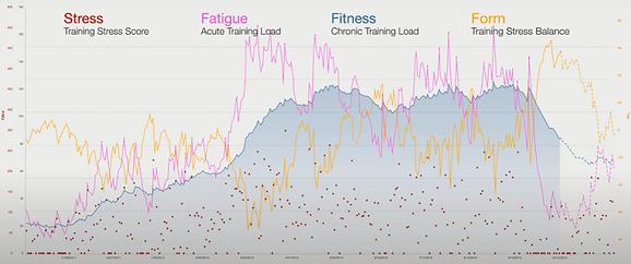
I read more about data visualization best practices and decided on a line graph (to best depict multiple data sets over a period of time).
-
I spent several hours on subject matter research, including articles, videos, and a free trial with a competitor product.
Samples of athletic performance learning & graphs


Architectural Exploration
I needed to start designing the user's journey, including screens, additional features, and actions. I started sketching out the primary architecture of the app, answering the questions...
-
What would users want to see or do?
-
Where would they find this (which screens)?
-
Which users would most likely perform the task? (This helped me keep the personas at the center of the process.)
Action:
View trend data at-a-glance
Screen:
My Day / Home Dashboard

Action:
View detailed metrics
Screen:
Performance Trends Details


Action:
View data over time
How:
Select Date Range


Action:
Personalize by activity and/or data set
How:
Filter Activities; Toggle Data Sets

Action:
Learn how trends are calculated
Screen:
Main Help/Knowledge Base
Screens (multiple):
One for Each Metric
Screens (multiple):
One for Each Metric


Action:
Share with trainer
Screen:
Performance Details Main Screen (Trigger Overlay)
Share w/Trainer Link; Type Message; Send

Wireframes
I needed to start filling in some of the screen and interaction details, so I worked on some grayscale low/mid-fi wireframes. Low or mid-fi is less time-intensive than full-color designs, allowing me to work more quickly. I added a little more detail where it made sense, like on the Performance Trends main screen, but kept the other screen details very minimal.
Select Wireframes
Main Home Dashboard
Uses existing app layout with new "Performance Trends" section.

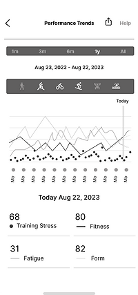
Performance Trends Main Screen
Follows existing app architecture and interactions, although the activity icon interactivity is new.
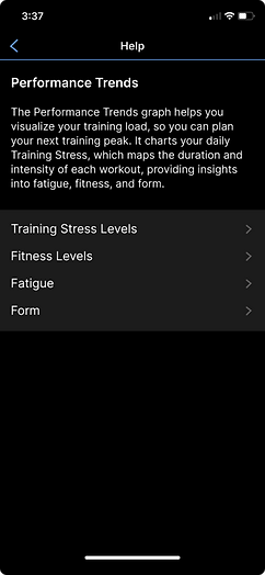
Performance Trends Knowledge Base
Includes a basic explanation of the Performance Trends graph, plus a drill-down into each data type.
Training Stress Knowledge Base
Here is an example of a more granular-level knowledge base screen.
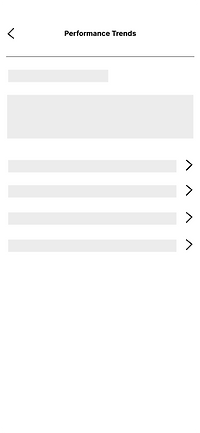

In addition to the wireframes, I added basic annotations to help fill in any gaps for the design team and other stakeholders, including how users would find the new feature section, how the graph would be laid out, and other interaction and branding notes.

High-fidelity screens
I needed to make sure the new feature sections and screens would seamlessly integrate into the existing interface, so I created high-fidelity screens using Garmin colors and branding. The eyedropper tool was perfect for replicating color values, but I did have to approximate the activity icons and some other design elements.

Mockup of the home dashboard with the new Performance Trends section, using existing Garmin branding.
This home dashboard mockup uses screenshots of the existing interface - except for the new Performance Trends section which repurposes a color palette from another of Garmin Connect's feature screens.
Using a few screenshots helped reduce design time and also kept the visual design in alignment with current branding/design systems.
First Version
Original High-fidelity Screens

Users can select a date range (follows current app design protocol) and filter by activity - particularly useful if training for a race event. (Activity filtering went through a redesign after usability testing.)


Based on examples from existing competitor app graphs, users can toggle data sets for a more tailored view.
Tapping Help opens the Knowledge Library to educate users about the Performance Trends feature and various data sets, helping them understand how they can use their reading to improve performance. (The interaction design is consistent with the existing protocol.)


Tap "share"

Overlay: select My Trainer

Type and send message

Receive confirmation

Users wanted to be able to share metrics with their coach or trainer. These screens show the first set of flows used in usability testing.
Usability Testing
In order to determine where the design was successful and where it might need some work, I tested some key flows with actual users.
Using a high-fidelity Figma prototype, I held five moderated usability tests.
-
High-fidelity screens with programmed interactions provided a realistic look and feel;
-
Moderated testing allowed me to communicate directly with users about their experience with each task or feature.
Overview
Method
Moderated (1 in person; 4 via web video)
Participants
5 Participants; ages 28 - 58
Success Metrics
-
# of errors
-
Ease of use % score
-
Consistency with current UI design

Tasks and interactions I used for testing:
1. Navigation
a. View Performance Trends Details
b. Find Learning Library
c. Learn more about Training Stress
d. Return to Home screen
2. Data Filtering
a. View data for last 1 year
b. Filter activities by sport: duathlon
3. Sharing/Messaging
Share performance trends with your trainer; add a message
4. Toggles
Remove (toggle off) all trend lines
Testing Results
Brand Alignment
✅ All participants agreed that the branding of the new feature on the home dashboard was consistent with the existing branding.
Usability/Efficiency
⚠️ 3 tasks failed usability test and require iteration/improvement
⚠️ 1 task passed usability test (so it's not represented on the results table) but produced user friction and may benefit from iteration

Testing Results Presentation
To organize the testing results in a more visual format (and thinking ahead to what I would need for iterations), I created a slide deck-style presentation highlighting:
-
the action/task that was performed
-
whether the task interactivity followed existing (or new) protocol
-
errors & ease of use score
-
user comments
-
whether further iteration would be needed or recommended
Here are a couple sample presentation slides shared with my mentor and peers. (If this were a "real" project, I would share this with the project team and stakeholders.)


And here's the final summary slide for all four areas I recommended further discussion or iteration. This also served as my "cheat sheet" for iterations.

Iterations
The next step was to determine which iterations would be the biggest "wins" for users and for the company. In other words, which improvements could have the greatest impact, while falling within design and development constraints?
1.
Simplify Activity Filtering (+ look at improving "?" Tooltip)
2.
Message Sharing - Build Out/Refine or Remove
3.
Data Set Toggle Section - Improve Hierarchy
For efficient use of time, I used the screens and annotations from the usability testing stakeholder presentation as a quick guide for iterations. For easy comparison, I showed "before" and "after" screens, along with annotations for greater clarity.
💡 Add-On Feature: Event Database
While exploring iteration designs during a team session, an idea emerged that could increase user excitement, engagement, and success: the ability for users to select and link to a race event from Garmin's event database.*
How It Adds Value
Usability/Efficiency:
Race selection auto-updates activity data by race type.
Satisfaction/Engagement/Success:
-
Keeps event details front-and-center as users are in training.
-
Could inspire motivation, even encouraging some to train for their first race.
I included this feature in the first round of iterations for further user testing. (See how the design turned out below!)
*The event database feature is an upgrade of an existing feature which didn't exist on mobile when I started this project. While users could search for a race event using the desktop app (in a clunky, unintuitive way), it was only introduced to the mobile app at some point in the late design stages of this project.
Iterations #1:
Activity Selection & Tooltip
Problems
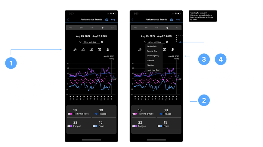
Solutions
New: Training for an event Overlay


Iterations #1 Summary
PROBLEM
Users expected activity icons to be interactive
SOLUTION
Activity icons are interactive; labels were added to aid recognition.
PROBLEM
Friction & redundancy w/ dropdown menu
SOLUTION
Dropdown menu was removed to simplify selection process (not needed).
PROBLEM
"Training for an event?" tool tip overlooked/not used as intended. Is there a greater opportunity here?
SOLUTION
"Training for an event?" tooltip/overlay was removed. Replace w/prominent button triggering the event database feature.
Iteration #2:
Message Sharing
Problems

Solutions

Iterations #2 Summary
PROBLEM
Feature caused friction in the form of questions/how it fits within the rest of the UI.
SOLUTION
Removed "share with trainer" feature. Revert to sharing via weblink. Consider redesign/fleshing out for future feature launch.
Iteration #3:
Toggle Hierarchy
Problems

Solutions

Iterations #3 Summary
PROBLEM
Feature caused friction as users attempted to toggle Fitness, then asked why it was not interactive like the other data types.
SOLUTION
Visually separated Fitness from the other (toggle-able) data types, with a fixed tooltip explaining the function of Fitness score.
Final Thoughts
This was an excellent opportunity to integrate new features into an existing product in an industry that is important to me - personal health and fitness. However, it was not without its challenges:
-
Finding a large enough sample size for interviews within a short time frame
-
Designing a feature which falls outside my area of expertise
-
Assumptions about pain points based on my own experience
-
Starting with a feature idea and trying to back up my assumptions with research (kind of a backwards approach)
After unsuccessfully trying to make my feature idea "fit," I finally let go of my expectations and followed the research to a juicy problem to solve.
Through critical thinking and following the design process, I was able to design what I believe could be an impactful feature for Garmin and for its users. 🏆


